

A wonderful morning sharing the studio with Corrine, Morgan, Dave and Sally. They produced some fab prints. Exploring different types of lino first to get a feel for the linocut tools, they then found images for inspiration and were completely absorbed in the process of carving and printing. Thanks to all for bringing lots of enthusiasm and laughter too!

The Practice of Contemporary Printmaking
Over the weekend while I was researching the woodcuts of Antonio Frasconi, I stumbled across this film (54mins) by Reelife Productions discussing contemporary approaches to printmaking at University Museum of Contemporary Art, MA. I love what each of these artists are doing independently and wanted to share their thoughts on the practice of contemporary printmaking.
Many artists use a variety of techniques to make their mark - from the hand printed woodblock to the mechanical mark of the digital printer. As part of my own process I use a digital printer to scan and transfer my sketches to the woodblock. I then carve and print the woodblock by hand. It's the physicality of the hand-made process that I really love but I also really appreciate the wonders of digital technology for it too has its purpose in the process.
October 22, 2014
from http://www.museums10.org/?op=events/past&m=10
The practice of printmaking over the last decades is no longer considered the poor cousin to painting, sculpting, or photography but is coming out of the shadow as an individual art form. In fact, creating prints offers a wide range of approaches and techniques that are both demanding and stimulating, stretching artistic explorations and processes. In conjunction with the exhibition The Art of Collecting: Contemporary Prints from the Risa Gerrig Collection, the University Museum of Contemporary Art at UMass Amherst invited Lyell Castonguay, Liz Chalfin, and Mikael Petraccia to discuss contemporary approaches to printmaking.
Lyell Castonguay, large scale printer and director of the print collective BIG INK, works with very large scale woodcuts. His influences include Antonio Frasconi, Leonard Baskin, Bruce Waldman, and Christopher Hartshorne, among others.
Liz Chalfin, director and resident artist at
non-toxic Zea Mays Printmaking Studio, conducts workshops and teaches safe printmaking practices. She has been visiting artist in the Marvin Bileck Printmaking Project, Bowdoin College, San Alejandro Academy of Fine Arts, Havana, Cuba, among others and was juror of the 86th Annual Honolulu Printmakers' exhibition.
Mikael Petraccia teaches Digital Intaglio,
Digital Print Processes and Media, Silkscreen, and Master Printer, a multi-disciplinary print class at
the Art Department at UMass Amherst. His work
was recently shown at the APE Gallery in Northampton, MA.
video produced by ReelifeProductions.com
“You can print something off on an inkjet printer, then expose it to that plate, you’re taking a digital process but then you’re kind of shaping it to that traditional media, that traditional method and making it work within those boundaries.”
Liz Chalfin
Liz Chalfin is director and resident artist at Zea Mays Printmaking Studio. Liz explores non-toxic, greener alternatives to the traditional toxic printing processes encouraging a healthier safer working environment for printmakers. From soya sauce as a de-greaser, powdered sugar into aqua tint option and instant coffee as a painterly etching technique.
“When it becomes another tool in the artist’s toolbox I think then it’s really interesting. When it’s just a re-productive process to produce someone’s painting - that’s when I find it really frustrating because its muddying people’s understanding of what an original print is and what an edition print is, and I think that’s really a disservice to the art world and to printmakers especially. But when the whole digital aspect becomes another tool, then it’s really exciting.”
Liz worked with Scott Prior, a Realist painter who wanted to find a way to make prints that kept the light and colour and realism that are in his paintings. They explored multiple etchings and photo polymer plates. Nothing worked until they combined the digital layer with a handprinted layer which really captured that light in his paintings.
Mikael Petraccia
Mikael Petraccia teaches digital intaglio, digital print processes and media, silkscreen and master printer as part of a multi-disciplinary print class at the art department UMass Amherst.
Falling in Love with Printing
“It’s a new mark - and it has its place depending on the work. It’s very mechanical - you have to work with the machine and work with the mark that it makes. I think that’s where it’s successful. With lithography the ink sits on the surface and there is a presence that you do not find in digital printing - and that physicality is different. The emotion that you have with this is very different - and that’s still present - when you introduce people to it they fall in love with it.”
I appreciate the digital world has a wonderful part to play in contemporary art and it is through this digital space that I stumble upon amazing artists such as Lyell Castonguay. With his wild winged larger than life prints, I know I am absolutely in love with the physicality of the hand carved woodblock print.
Making Friends with your Adana Press - Special thanks to Angie & Si Butler

Thank you so much Angie and Si Butler for helping me set up my Adana Press correctly. I had been having some issues with the press and just couldn't figure it out. After too much wasted paper I realised I was not making any progress so I contacted Angie for help. The Adana 8 x 5 is an old printing press and there are many variables as to why something may not be working properly. With a wealth of letterpress experience and attention to detail, Angie and Si helped solve the issue. I am very grateful for their help and I completely recommend anyone who needs to understand their Adana a bit more, to book their summer course coming up in July. More details about the course on UWE's Centre for Fine Print Research courses page:
Netsuke in Copenhagen
Last September I envisaged a trip to Copenhagen after talking with friends about their experiences in this wonderful city. Six months later I am snacking on rugbrød and drinking mint and lemongrass tea in a cafe overlooking 'Sortedams Sø' lake in the centre of the city. Then back on the bike cycling round the vibrant streets. It’s the most cycle friendly city I have ever been to and hiring bikes is the best way to immerse ourselves in the abundance of antique shops, cafes and galleries.
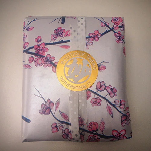
Boutique Taeko
On our way to Designmuseum Danmark we stumble upon 'Boutique Taeko', a tiny Japanese shop on Gothersgade street, stocked with traditional and modern pottery, bowls, cups and teapots. The owner, Taeko, is open and warm and wraps our bowls beautifully in cherry blossom wrapping paper with silver spotted ribbon. She recommends we make a visit to the Design Museum to see the current exhibition "Learning from Japan" which brings together a collection of Japanese and Danish design. We just happen to be heading that way so this is perfect synchronicity.
Learning from Japan - Designmuseum Danmark
“Learning from Japan will present the Museum’s impressive Japanese collection alongside Japanese-inspired Danish arts and crafts, design, architecture and graphics.”
Netsuke
We arrive at Designmuseum Danmark and I am hoping to find some netsuke. The entrance to the exhibition first takes us into the Klint* cafe looking out to the central museum garden. The sun is shining, a rarity, mid March in Copenhagen. Another door leads us to a bookshop and finally we step into a room full of glass cabinets. The walls are lined with Japanese woodblock prints of Japanese couples sharing tea, scenic views of nature, woodblock printed posters and paper cutouts.
“Meanwhile, in the section devoted to architecture and interior decoration, visitors will see what an important role nature also played in this context. The similarity between Danish and Japanese applied art stems from both countries’ lack of domestic minerals, metals and fuels. Also, given that Japan is covered by rich forestland, wood has been a significant source for the design of houses and furniture”
Glass cabinets are themed with wooden sculptures, woodblock prints by Hiroshige, pottery, fashion and textiles. A cabinet of fish, a cabinet of frogs, birds and turtles in many forms. Soon I find a glass cabinet with an array of ceramic and carved wooden animals and there huddled next to a startled wooden cat, (an incense burner) is a tiny wooden netsuke in the shape of a hare.

I continue weaving around the glass cabinets finding just two more wooden netsuke, "Sitting Man Modelling a Mask," and "Mask in the Shape of a Lion".


On a wall at the end of the room hangs “The Japanese Diary” by Lis Gram based on inspirations from Japan. An embroidered tapestry of woven fabric, plastic, paper, nylon and thread stretches from the ceiling to the floor and comes alive when you stand right up close. This is where "Learning from Japan" exhibition finishes and yet you know Japan continues its influence on Danish design as you walk through centuries of Fashion and Fabric, Danish Arts and Crafts from 1890 - 1910 and Design and Crafts from the 20th Century until you finally find yourself in the 21st Century standing in front of a bicycle made from bamboo. This is "Danish Design Now".
*Furniture designer, Kaare Klint, is a central figure in the history of Danish design and the restoration of the Designmuseum Denmark.
A Short Film Part 2
Heron Shade EP Woodblock Print by www.eightfivepress.co.uk
Music by www.reddeersleeping.co.uk
Heron print on front cover and disc label hand-printed with Japanese carbon ink from a hand carved woodblock.
Back cover typeset with 24pt Univers metal type printed with gold letterpress ink on the Adana 8 X 5 platen press.
Heron Shade title on front cover printed using blind deboss on the Adana 8 x 5.
Limited edition of 100 EPs.
Each cd is packaged in a 100% recycled card sleeve with a digitally printed insert on recycled paper.
Heron Shade EP is available to order at reddeersleeping.bandcamp.com
Heron Shade Woodblock Print
In January 2015 I began a journey into woodblock printing, focusing on Japanese netsuke. In February 2015, alongside the netsuke animal print explorations, I made a woodblock print of a heron. See my Into The Wood project for more about this process. At the time I had no purpose for the heron, only to explore the woodblock process. It sat on the shelf for quite a few months until November 2015 when I decided to make my EP Heron Shade. It was the perfect image for the cover and so I decided to hand-print each EP with the heron woodblock. Here's a short film (1m 57s) showing snippets of the process and materials used to print the woodblock.
The song 'Orange' from Christina Rossetti's original poem 'Color' is the soundtrack for the film and also features on the EP.